Ever heard of the saying “less is more”?
While this saying will never get applied to visiting your local bakery, it is a vital concept for wireframes that makes them shine. You might be thinking, how does designing less lead to more? This is the power of wireframing. So, let’s explore the brilliance of wireframes and why they should be a vital part of your UX process.
What is a wireframe?
Picture this, imagine building a house without a plan or foundations. Doesn’t seem to make any sense - something is bound to go wrong. Start building and find a room does not work? That’s a lot of bricks to rebuild. The same applies to your UX design process.
Wireframes serve as the blueprint for your design, illustrating the arrangement of elements, user flow, layout, information architecture, behaviours, and overall structure. The key element to wireframes is that they deviate away from aesthetic details. Just simple monochrome designs. Wireframes can be hand drawn or built out digitally on software. - “Because Even Picasso Sketched Before Masterpieces”
True wireframes can be broken down into two states:
Low-fidelity wireframes
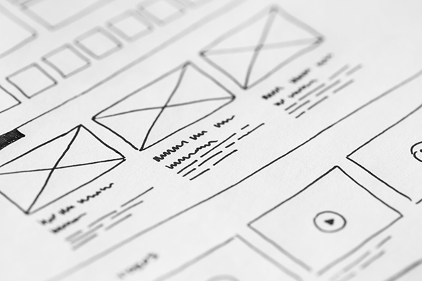
Low-fidelity is a very rough visual representation of a design. Often done as sketches, they are a great starting point to get ideas down and quickly iterate through ideas.
Purpose: Focuses on layout and structure, neglecting details like colours and images. Ideal for quick ideation and initial concept validation.

Mid-Fidelity wireframes
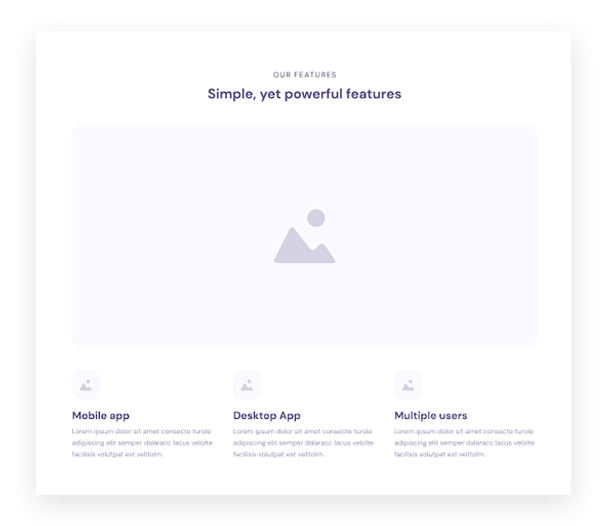
Strikes a balance between simplicity and detail, incorporating more visual elements than low-fidelity wireframes. They show a more detailed view of specific features and layouts. Mostly created on Figma or Adobe Xd.
Purpose: Provides a more comprehensive view of the design while still avoiding intricate details. Suitable for presenting to stakeholders and gathering initial feedback.

So, why are wireframes important?
Wireframes are the first step during the exploratory design phase, and as discussed will act as the blueprint for the rest of the design.
The goal of wireframes is to provide a quick visual representation of the design, with the challenge of providing only the essential information needed to convey this without distractions from the goal (more on this below). As stated, less is more.
Keeps the focus
As a designer, it can be tempting to jump straight into a full-on design, focusing on that CTA colour and nailing the perfect drop-shadow. Wireframes force you to hold your horses and reign it in, focusing on the core components and functionality. They divert all that attention into purely creating a design that focuses on functionality and the user experience.
Wireframes make the user experience the primary topic
As mentioned, wireframes keep the focus on the user experience. This applies to designers and clients.
They allow the designer to make sure that the design, page content and functionality are positioned correctly to create a useful and usable design that aligns with the user's needs. Wireframes can help decide:
- Information hierarchy and structure – Does the design provide all the information users need, creating a cohesive experience?
- Features – Are we adding features that are relevant and solve the users’ problems?
- User Behaviour – How will the user interact with the design; does it meet their expectations and common user patterns?
For clients, wireframes avoid them getting distracted by colours, logo size and images. They are important and that conversation will happen, but at this stage, it keeps the conversation and feedback about the end user, purpose, and structure of the design.
Saves time… and money.
After grafting through research and gathering insights, your mind should be bursting with solutions on how to solve your problem.
Wireframing can quickly validate if the idea or feature in your head translates well into real life, producing a time-efficient process. However, the inevitability of design changes, spurred by internal teams or client feedback, remains a constant. Leveraging wireframes allows for agile iterations at minimal cost and time investment, steering clear of the resource-intensive production of high-fidelity designs. It is time well spent and highly efficient.
All aboard!
With quick iterations can come more conversations between more team members and stakeholders. Developers, designers, Clients and PMs can all make crucial assessments in the early stages of design, allowing everyone to understand and agree on the user experience being created.
So, why would you not wireframe?
Hold on, I thought you were saying wireframes are the best thing since sliced bread. Sometimes there can be downsides to wireframes, however, we have provided some tips on how to overcome these.
Confused clients
Wireframes can feel complicated to present to clients. A skeleton design full of monochrome boxes and placeholder images can feel misleading and less engaging. Clients may not be impressed. So, how do you present wireframes to clients?
Take time to explain the goals and what is trying to be achieved. This is where your communication skills come in. Avoid jargon, highlight certain functionality elements and take users on a story, providing context to what they are being shown.
*Tip: Use your research findings as a reference as you walk the client through wireframes. The research phase may be done at this stage, but that does not mean it needs to gather dust.
It's faster to skip wireframes.
While yes on paper it can seem that way. But skipping them now can increase costs further down the line. You wouldn’t skip the research and make assumptions, so why start skipping now? As discussed, it is far quicker to make changes to a wireframe than it is to a high-fidelity design.
The Takeaway
Being simple is what wireframes are all about. Often neglected or done as a tick box exercise, this result of a poor understanding of their benefits leads to a poor UX solution that has often had more time spent on it than what needs to be.
As we've explored, wireframes keep designers on track, resisting the temptation to dive into aesthetic details prematurely. They redirect attention to core components, ensuring that every design decision aligns seamlessly with the end user's needs and expectations.
So, why would you not wireframe? In the quest for UX excellence, embracing the simplicity of wireframes is the key to unlocking a more streamlined, user-focused, and cost-effective UX solution. It goes back to the original statement. Designing less leads to more. Wireframes, often overlooked, deserve their standing ovation as the silent architects behind UX design brilliance.
Are you ready?
Ready to elevate the user experience on your website? At Spinbox, we use not only wireframes – but wield a comprehensive arsenal of UX research and analysis techniques to understand, solve, design, and build a better digital experience. Connect with us today to unleash the full potential of your online presence. Let's collaborate to create a website that not only meets but exceeds user expectations.